
Can a portrait be taken with a typewriter?
Such question sprang to my mind when, in Waterstones’ London bookshop in Piccadilly (on a display table aptly named “Typographical titillation”), I came across a delightful book by Marvin and Ruth Sackner, “The art of typewriting” (Thames & Hudson). The authors, a retired neurologist and his wife, own the largest collection of type art – the book showcases a well-thought selection from their “Archive of Concrete and Visual Poetry”, based in Miami Beach, Florida.
This fascinating form of visual art created on typewriters is first and foremost a connection between images and words, between shape and meaning – it’s a kind of art which is created out of words, either if it’s concrete poetry (= “worded images”) or visual poetry (= “imaged words”). Nevertheless, letters typed on paper can also be seen as building blocks of an entirely visual artwork, to be seen and not to be read .
Typed letters like a brush, like gelatin silver, like pixels – and therefore apt to create a portrait.
Interestingly, as the book shows, one of the first of such typed artworks was indeed a portrait: of Queen Victoria, by C.M. Patterson, dated 1895 and, the original caption reads, “executed on an Oliver Typewriter” (the latter specification made me smile – I sensed here the same urge that nowadays pushes photographers to state, when talking about their last portrait, “shot on Canon 6D with Sigma 35mm f/1.4”).
In the early 1920s Hobart Reese endured his 15 minutes of fame for creating realistic “typewritten portraits” of Hollywood actors and politicians (“The latest in portraits – typed while you wait”, boasted the “Science and Invention” magazine publishing his artefact). Reese’s work – like, it has to be said, every artwork created on typewriters – is one of astonishing dexterity, but, in his hyperrealistic effort to camouflage the typed pattern (to the observer’s naked eye it looks like pencil), he was somehow missing the point.
Typed portraits are way more interesting when they disclose the medium they use, not when they disguise it.
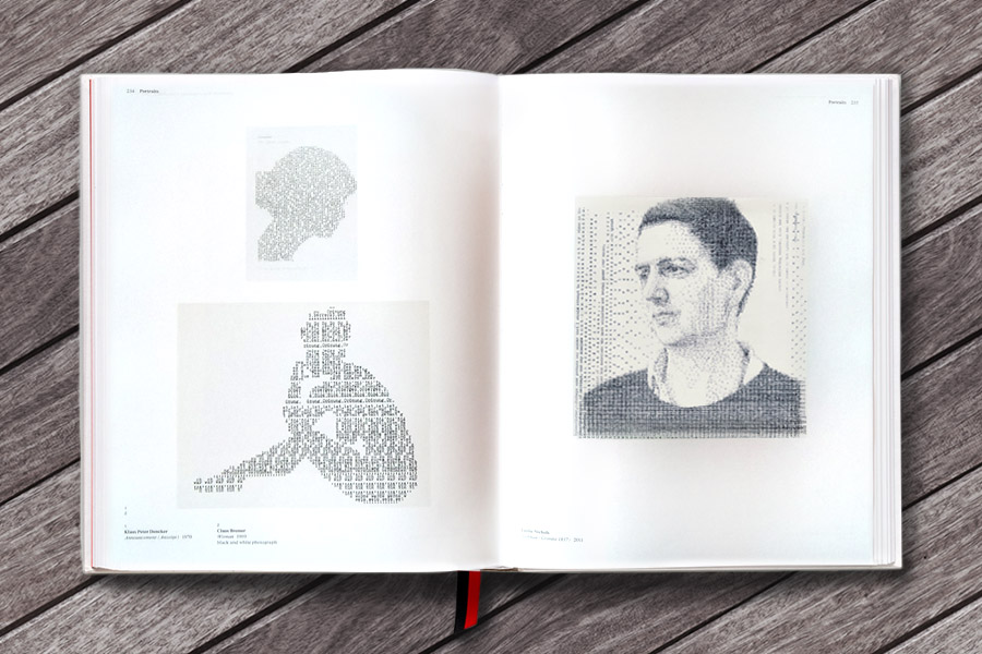
It is a real treat to flip through the pages of such a fascinating book, filled with nearly 600 illustrations. (With a very clever move, its designers placed, as a ribbon marker, a black/red ribbon which takes the readers – unless they’re millennials, of course – straight down memory lane of onion skin paper, clack! clack!, hammers jammed into each other, the little bell going off etc. etc.)
Looking for portraits as I did – here is a typed portrait of Shirley Temple by Julius Nelson, which exemplifies one of the possible methods to achieve shading which is, in this case, the use of different letters: light intensity can be obtained with a colon and a period, while the uppercase letters M, N, I, V and Z create darker areas.
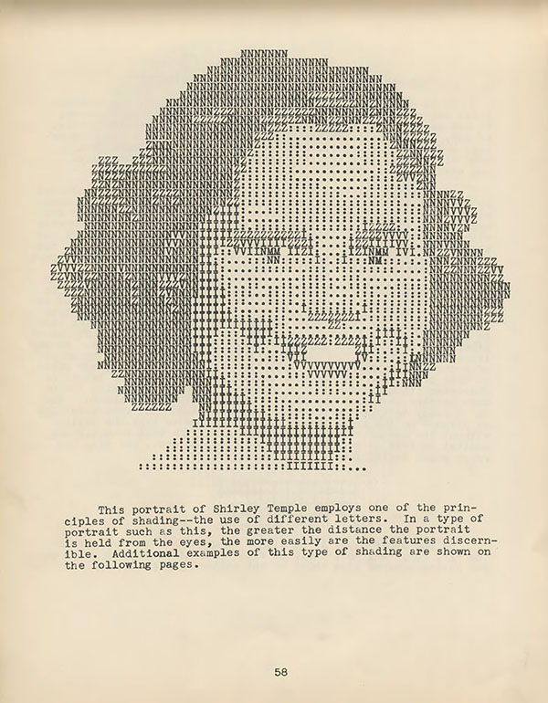
Nelson’s work dates back to 1940, whilst ASCII art created on computers and the green rain (the falling green computer code symbolising The Matrix in the homonymous film) came much later.
Among the (few) typed portraits featured in “The art of typewriting”, my favourite is Vivant!, the portrait of George Orwell by Michel Corfou (1978). The author of “1984” is portrayed with a ghostly, egg-shaped head, sketched mainly using question marks. Shading is achieved by overstriking some letters – this gives a feel of a redacted document to the artwork, which I find so… well, I would describe it as quite Orwellian, if the word weren’t so overused into meaninglessness.
This is a portrait that, without attempting to imitate a photographic image or a drawing, enhances the specificity of the medium – typed letters as letters to be read and as patterns to be seen.
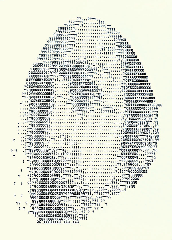
Looking at Orwell’s face, the viewer’s attention is constantly swinging between staring at his eyes and trying to make sense of the letters they are made of.
Typewriters have always evoked alternative subcultures, informal ways to communicate, fanzines and the like. And yet an intriguing aspect of typed art in general (and even more of its sub-category “typed portraits”) is that, while it projects “an illusion of informality or immediacy” (Steven Heller, from his forewords), it is, in fact, creating something unique. A typed portrait can be considered a one-off edition – closer, in this respect, to a painted portrait rather than a photo portrait.
In our digital age, the old-fashioned typewriter is having a revival across the creative industries. “Short of chiseled words in stone, few handmade items last longer than a typed letter, for the ink is physically stamped into the very fibers of the paper”, Tom Hanks waxed lyrical in his ode to the typewriter in the New York Times.
The typewriter as a drawing tool is also enjoying a renaissance – and, consequently, the typed portraiture too. One of the most recent typed portraits displayed in the book “The art of typewriting” is by the Kentucky-based artist Leslie Nilson.
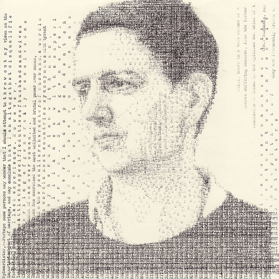
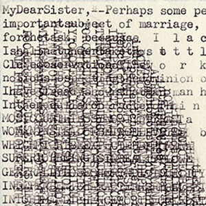
The portrait, typed in 2011, features the British artist Siobhan Liddell, whose face is finely interwoven with text from “Letters on the Equality of the Sexes” written by the proto-feminist Sarah Moore Grimké in 1837.
This is a very modern-looking portrait, filled with humanity and delicate intricacy.
I could pretend I typed this post on my Dad’s Olivetti Lettera 32, but sadly I didn’t – the green beauty was not with me at this time of writing. However, as if I did, I’ll end my hard work with the most amusing typed portrait I found in “The art of typewriting” – it’ s a self-portrait by the author Earl Conrad, which stood as (self) dedication in his avant-garde book “Typoo;: A novel”.
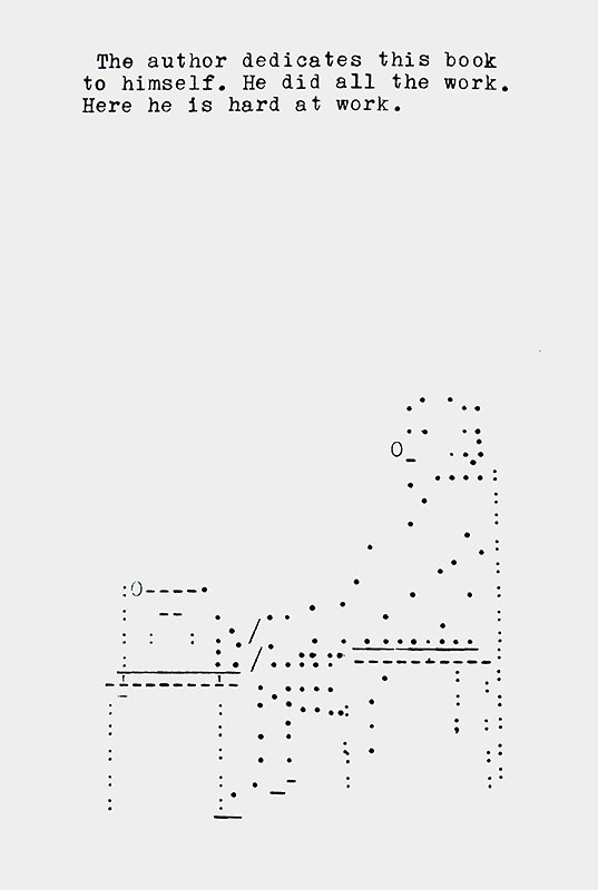
Better than my selfie on Instagram, I guess.